1 - The unique South African coastline
The intention of this blogs and future blogs are to show the approach and R scripts used to analyse the possible reasons for temperature variation between sites within the same cluster along the coast of South Africa and the controlling influences of temperatures within coastal zones. By doing this assessment we will be able to learn various tidyverse programming techniques and also gain skills on how to map, plot graphs and do various statistical analyses. These blogs will be decided into various section comprising of statistics and interpretations with the aim of assisting students and researchers.
Background
Seawater temperature is a key indicator of environmental change in marine ecosystems. Nearshore processes, such as wave action, coastal winds, and surface radiant heating, and the thermal properties of the substratum, are a few of the factors that have been implicated in affecting thermal variability across small spatial scales.
Temperature variability of the coastal region of South Africa, spanning approximately 3,100 km in distance, has not yet been studied in great detail at highly localised scales. At the broad scale, this region exhibits a large variation in seawater temperatures along its coastline and is divided into four bioregions, each with contrasting temperatures. These bioregions are the Benguela Marine Province (BMP), Benguela-Agulhas Transition Zone (B-ATZ), the Agulhas Marine Province (AMP) and the East Coast Transition Zone (ECTZ). These regions display noticeable differences in seawater temperatures in comparison to each other, primarily due to the influences of the neighbouring ocean currents.
The task for today is to ….
Startup
First we need to find, install and load various packages. These packages will be available on CRAN and can be accessed and installed in the usual way.
knitr::opts_chunk$set(
  comment = "R>",
  warning = FALSE,
  message = FALSE
)

library(tidyverse)
## ── Attaching packages ───────────────────────────────────────────────────────────────────────────────────── tidyverse 1.3.0 ──
## ✔ ggplot2 3.2.1     ✔ purrr   0.3.3
## ✔ tibble  2.1.3     ✔ dplyr   0.8.3
## ✔ tidyr   1.1.1     ✔ stringr 1.4.0
## ✔ readr   1.3.1     ✔ forcats 0.4.0
## ── Conflicts ──────────────────────────────────────────────────────────────────────────────────────── tidyverse_conflicts() ──
## ✖ dplyr::filter() masks stats::filter()
## ✖ dplyr::lag()    masks stats::lag()
library(ggpubr)
## Loading required package: magrittr
##
## Attaching package: 'magrittr'
## The following object is masked from 'package:purrr':
##
##     set_names
## The following object is masked from 'package:tidyr':
##
##     extract
library(zoo)
##
## Attaching package: 'zoo'
## The following objects are masked from 'package:base':
##
##     as.Date, as.Date.numeric
library(lubridate)
##
## Attaching package: 'lubridate'
## The following object is masked from 'package:base':
##
##     date
library(ggrepel)
library(FNN)
library(stringr)
library(viridis)
## Loading required package: viridisLite
library(gridExtra)
##
## Attaching package: 'gridExtra'
## The following object is masked from 'package:dplyr':
##
##     combine
library(dplyr)
source("functions/scale.bar.func.R")
##
## Attaching package: 'maps'
## The following object is masked from 'package:purrr':
##
##     map
## Loading required package: sp
## Checking rgeos availability: TRUE
Load data
Now to get to the data. The first step involves the loading of the site list. This data represents the statistical properties of the seawater temperature representing the South African coastline, such as the mean, minimum and maximum temperatures. These values vary among coastal sections due to the influence of the cold Benguala and warm Agulhas currents.
load("data/site_list_v4.2.RData")Clustering
Thereafter we performing the k-means clustering on a data matrix using the kmeans() function, which uses multiple random seeds to find a number of clusting solutions; it selects as the final solution the one that has the minimum total within-cluster sum of squared distances. These variables include the mean, min and max temperature values. This allows me to group sites based on similar temperature variations.
set.seed(10)
kmeans(site_list[,c(15, 18, 19)], 6)$cluster
R>   [1] 5 5 5 5 5 5 5 5 5 5 5 5 5 5 5 5 5 5 5 5 5 5 5 5 5 5 5 5 3 3 3 5 3 3 5 3 3
R>  [38] 3 3 3 3 3 3 3 3 3 3 3 3 3 3 3 3 3 3 3 3 3 3 3 3 3 3 3 3 3 3 3 3 3 3 3 1 1
R>  [75] 2 2 1 2 1 1 1 4 1 1 1 1 1 1 1 1 1 1 1 1 1 1 1 1 1 1 1 2 2 2 1 1 1 1 4 1 1
R> [112] 2 1 1 4 2 4 1 4 2 4 4 4 2 2 2 2 1 2 2 6 6 6 6 6
clust_columns <- site_list[,c(15, 18:19)]
The coastal region is divided into three sections, namely the cold west coast, warm east coast and the subtropical south coast. The Benguela Marine Province (BMP) is located to the west of Cape Point and is characterized by the movement of cold water from the Southern Ocean moving north. The cold temperate west coast mentioned above is greatly affected by the upwelling caused by offshore winds, generated by the cold Benguela current. Thus the seawater temperatures found around South Africa’s coastline exhibits a large variational range.
Plotting the cluster analyses
clust_i <- function(i) {
  set.seed(10)
  ggplot(data = site_list,
         aes(x = lon, y = lat,
             colour = as.factor(kmeans(clust_columns, i)$cluster))) +
    borders() +
    geom_point() +
    labs(colour = "cluster") +
    coord_equal(xlim = c(15, 35), ylim = c(-37, -27)) +
    ggtitle(paste0("clust = ", i))
}
clust_8 <- clust_i(8)
clust_7 <- clust_i(7)
clust_6 <- clust_i(6)
clust_5 <- clust_i(5)
clust_4 <- clust_i(4)
clust_3 <- clust_i(3)
clusters <- ggarrange(clust_8, clust_7, clust_6, clust_5, clust_4, clust_3, common.legend = T)
clusters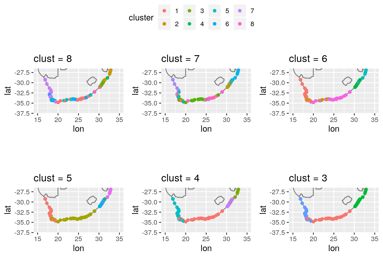
The plotting functions partition the data into the clusters and colour code each point accordingly so that we are able to see patterns that exist and distictly group the different sites with similar temperatures along the three distinct coasts. Cluster six was selected as this represented the most accurate and distinct site groupings based on this temperature distribution. Showing a distinct east, south and west coast based on the mean, min and max temperature values.
To wrap up this blog, the next bit of code we are loading in the datasets in order to better map our cluster analyses in order to show variation in temperature as mentioned in the literature.
load("data/sa_provinces.RData")
load("data/south_africa_coast.RData")
load("data/southern_africa_coast.Rdata")
load("data/africa_coast.RData")
load("data/sa_provinces_new.RData")
load("data/sa_coast.Rdata")
africa_map <- ggplot(africa_coast, aes(x = lon, y = lat)) +
  theme_bw() +
  coord_equal() +
  geom_polygon(aes(group = group), colour = "black", fill = "grey80") +
  geom_polygon(data = sa_provinces_new, (aes(group = group))) +
  annotate("text", label = "Africa", x = 16.0, y = 15.0, size = 3) +
  theme(panel.border = element_rect(colour = "black", size = 0.4),
        plot.background = element_blank(),
        axis.ticks = element_blank(),
        axis.text = element_blank(),
        axis.title = element_blank(),
        panel.grid.major = element_blank(),
        panel.grid.minor = element_blank()) +
  coord_map(xlim = c(-20, 53), ylim = c(-36, 38), projection = "mercator")
africa_map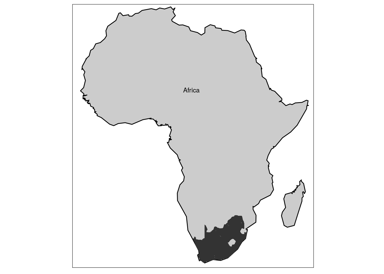
clust_i <- function(i) {
  set.seed(10)
  ggplot(data = south_africa_coast, aes(x = lon, y = lat)) +
    geom_polygon(aes(group = group), fill = "white") +
    borders() +
    geom_point(data = site_list,
               aes(x = lon, y = lat,
                   colour = as.factor(kmeans(clust_columns, i)$cluster), size = 2)) +
    labs(colour = "cluster")  +
    annotate("text", label = "INDIAN\nOCEAN", x = 34.00, y = -35.0,
             size = 4.0, angle = 0, colour = "black") +
    annotate("text", label = "ATLANTIC\nOCEAN", x = 14.00, y = -35.0,
             size = 4.0, angle = 0, colour = "black") +
    geom_segment(aes(x = 17.2, y = -32.6, xend = 15.2, yend = -29.5),
                 arrow = arrow(length = unit(0.3, "cm")),
                 size = 0.1, colour = "black") +
    annotate("text", label = "Benguela", x = 16.0, y = -31.7,
             size = 4, angle = 302, colour = "black") +
    geom_segment(aes(x = 33, y = -29.5, xend = 29.8, yend = -33.0),
                arrow = arrow(length = unit(0.3, "cm")),
                size = 0.1, colour = "black") +
    annotate("text", label = "Agulhas", x = 31.7, y = -31.7,
             size = 4, angle = 50, colour = "black") +
    # Improve on the x and y axis labels
    coord_fixed(ratio = 1, xlim = c(10.5, 39.5), ylim = c(-39.5, -25.5),
                expand = TRUE) +
    scale_x_continuous(expand = c(0, 0),
                       labels = scales::unit_format(unit = "°E", sep = "")) +
    scale_y_continuous(expand = c(0, 0),
                       labels = scales::unit_format(unit = "°S", sep = "")) +
    labs(x = NULL, y = NULL) +
    scaleBar(lon = 32.0, lat = -38.7, distanceLon = 200, distanceLat = 50,
             distanceLegend = 90, dist.unit = "km", arrow.length = 100,
             arrow.distance = 130, arrow.North.size = 3) +
    theme_bw() +
    theme(panel.border = element_rect(fill = NA, colour = "black", size = 1),
          axis.text = element_text(colour = "black", size = 18),
          axis.title = element_text(colour = "black", size = 18),
          axis.ticks = element_line(colour = "black"))
}

clust_6 <- clust_i(8)
clust_6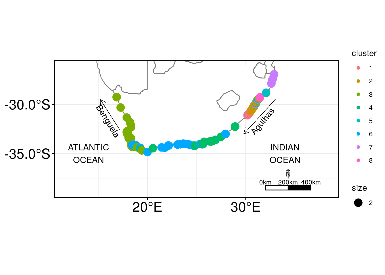
Amieroh Abrahams
Scientist with a passion for data, statistics; the ocean and the oceangraphic processes associated with it.