3 - Basic analyses and interpretation
Welcome back! I hope that the previous blogs were useful for its scientific insight and for enhancing your programming skills.
The intention of this blogs is to show the approach and R scripts used to analyse the possible reasons for temperature variation between sites within the same cluster along the coast of South Africa and the controlling influences of temperatures within coastal zones.
Startup
First we need to find, install and load various packages. These packages will be available on CRAN and can be accessed and installed in the usual way.
knitr::opts_chunk$set(
  comment = "R>",
  warning = FALSE,
  message = FALSE
)

library(tidyverse)
## ── Attaching packages ───────────────────────────────────────────────────────────────────────────────────── tidyverse 1.3.0 ──
## ✔ ggplot2 3.2.1     ✔ purrr   0.3.3
## ✔ tibble  2.1.3     ✔ dplyr   0.8.3
## ✔ tidyr   1.1.1     ✔ stringr 1.4.0
## ✔ readr   1.3.1     ✔ forcats 0.4.0
## ── Conflicts ──────────────────────────────────────────────────────────────────────────────────────── tidyverse_conflicts() ──
## ✖ dplyr::filter() masks stats::filter()
## ✖ dplyr::lag()    masks stats::lag()
library(ggpubr)
## Loading required package: magrittr
##
## Attaching package: 'magrittr'
## The following object is masked from 'package:purrr':
##
##     set_names
## The following object is masked from 'package:tidyr':
##
##     extract
library(zoo)
##
## Attaching package: 'zoo'
## The following objects are masked from 'package:base':
##
##     as.Date, as.Date.numeric
library(lubridate)
##
## Attaching package: 'lubridate'
## The following object is masked from 'package:base':
##
##     date
library(ggrepel)
library(FNN)
library(stringr)
library(viridis)
## Loading required package: viridisLite
library(gridExtra)
##
## Attaching package: 'gridExtra'
## The following object is masked from 'package:dplyr':
##
##     combine
library(dplyr)
Loading the data
The data being loaded here was created in the previous blog (2 - Clustering and plotting)
load("data/SACTN_clust_1_matched.RData")
load("data/SACTN_clust_2_matched.RData")
load("data/SACTN_clust_3_matched.RData")
load("data/SACTN_clust_4_matched.RData")
load("data/SACTN_clust_5_matched.RData")
load("data/SACTN_clust_6_matched.RData")


load("data/SACTN_clust_1_match.RData")
load("data/SACTN_clust_2_match.RData")
load("data/SACTN_clust_3_match.RData")
load("data/SACTN_clust_4_match.RData")
load("data/SACTN_clust_5_match.RData")
load("data/SACTN_clust_6_match.RData")
ANOVA
Anova analysis: This allows me to compare one variable in two or more groups taking into account the variability of other variables. This analysis of covariance is used to test the main effect of variables on a continuous variable. In this case we specifically analyse the - Relationship between index pair, year and season as a function of the mean temperature per year for each of the months. - The results shows a significant difference between each pair of sites within each of the cluster.
anova_func <- function(df){
  sites_aov <- aov(temp_mean_month_year ~ index_pair * year * season, data = df)
return(sites_aov)
}
anova_clus_1_func1 <- anova_func(df = SACTN_clust_1_matched)
summary(anova_clus_1_func1)
R> Df Sum Sq Mean Sq F value Pr(>F)
R> index_pair 2 15.28 7.642 12.071 8.76e-06 ***
R> year 1 0.07 0.072 0.114 0.73553
R> season 3 9.53 3.177 5.019 0.00205 **
R> index_pair:year 2 1.75 0.876 1.384 0.25198
R> index_pair:season 6 13.07 2.179 3.442 0.00261 **
R> year:season 3 4.01 1.338 2.113 0.09844 .
R> index_pair:year:season 6 7.93 1.322 2.088 0.05426 .
R> Residuals 326 206.39 0.633
R> ---
R> Signif. codes: 0 '***' 0.001 '**' 0.01 '*' 0.05 '.' 0.1 ' ' 1
R> 32 observations deleted due to missingness
# anova_clus_2_func1 <- anova_func(df = SACTN_clust_2_matched)
# summary(anova_clus_2_func1)
# anova_clus_3_func1 <- anova_func(df = SACTN_clust_3_matched)
# summary(anova_clus_3_func1)
# anova_clus_4_func1 <- anova_func(df = SACTN_clust_4_matched)
# summary(anova_clus_4_func1)
# anova_clus_5_func1 <- anova_func(df = SACTN_clust_5_matched)
# summary(anova_clus_5_func1)
# anova_clus_6_func1 <- anova_func(df = SACTN_clust_6_matched)
# summary(anova_clus_6_func1)Comparing sites
The code below lets us visualise the temperatures for each of the sites. This box plot allows me to observe whether or not a variation exist between the sites found within the same cluster. The values represent the distance “km” between the sites Temperature 1 represents a site and temperature 2 represents a second site. The boxplot shows the temperature variation of two sites within the same cluster (along the same coast) being compared to eachother. To conclude, temperatures were not uniformly distributed with each set of sites having a unique temperature variation.
addline_format <- function(x,...){
  gsub('-', '\n', x)
}
clust_plot <- function(df) {
  plot1 <- df %>%
    select(-index_1, -index_2) %>%
    mutate(index_pair = addline_format(index_pair)) %>%
    gather(key = "temp_grp", val = "temp", -date, -index_pair, - index_dist) %>%
    ggplot(aes(x = index_pair)) +
    geom_boxplot(aes(y = temp, fill = temp_grp), alpha = 0.3) +
    scale_fill_manual(values = c("khaki4", "chartreuse3")) +
    labs(x = "Paired Sites", y = "Temperature (°C)") +
    theme(legend.position="none") +
    theme_bw()+
    guides(fill = guide_legend(title = "Site\ntemperatures"))+
    coord_cartesian(ylim = c(0, 30)) +
    theme(axis.text = element_text(size = 8),
          axis.title = element_text(size = 10),
          legend.text = element_text(size = 10),
          legend.title = element_text(size = 1))
  return(plot1)
}
SACTN_clust_1_plot1 <- clust_plot(df = SACTN_clust_1_match)
SACTN_clust_2_plot1 <- clust_plot(df = SACTN_clust_2_match)
SACTN_clust_3_plot1 <- clust_plot(df = SACTN_clust_3_match)
SACTN_clust_4_plot1 <- clust_plot(df = SACTN_clust_4_match)
SACTN_clust_5_plot1 <- clust_plot(df = SACTN_clust_5_match)
SACTN_clust_6_plot1 <- clust_plot(df = SACTN_clust_6_match)
combined_plot <- ggarrange(SACTN_clust_1_plot1, SACTN_clust_2_plot1,
SACTN_clust_3_plot1, SACTN_clust_4_plot1,
SACTN_clust_5_plot1, SACTN_clust_6_plot1, ncol = 2, nrow = 3)
combined_plot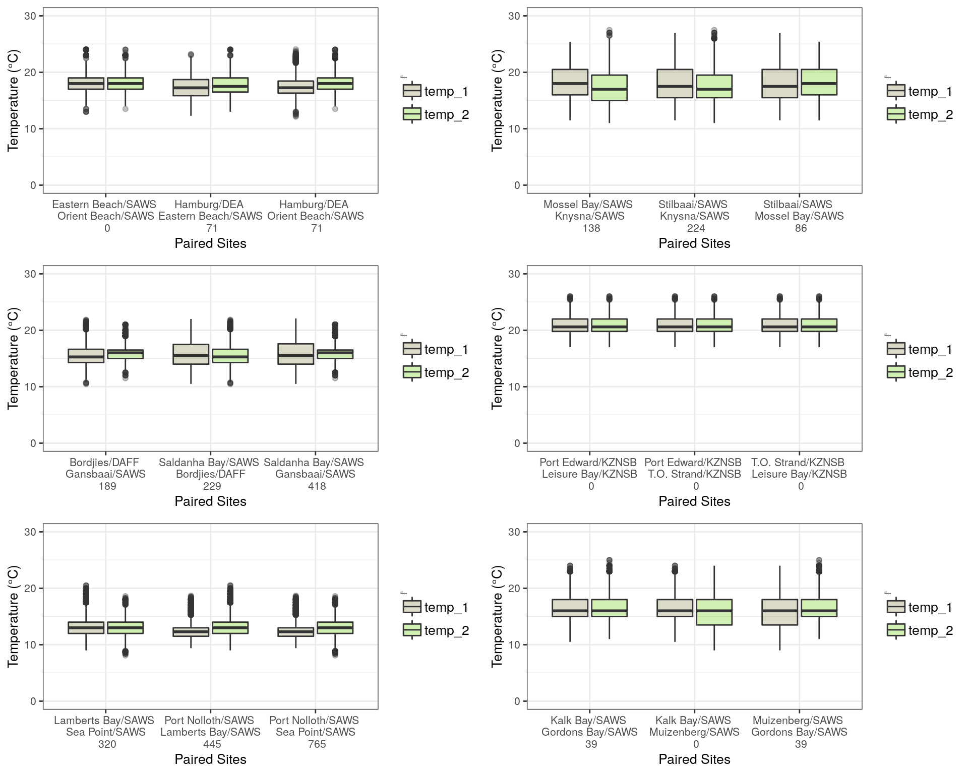
Figure 1: Boxplots representing the different site locations along the South African coast represented by various temperature parameters. Temperature parameters include minimum, maximum and mean temperatures (°C). The Boxplots represent the minimum, 25th percentile, median and 75th percentile of the temperatures measured. The interquartile can be dedudced by the difference between the percentiles with the dots representing the outliers in the data.
Temperatures were not uniformly distributed across our four clusters produced, with each set of sites having unique patterns of temperature variation. In cluster 1, which includes Humburg, Eastern Beach and Orient Beach, we found that temperature varied from approximately 13 ºC to 22 ºC. Within this cluster of sites, we found that Hamburg had the highest maximum temperatures and the lowest minimum temperatures between the three sites. Orient Beach had the lowest range of temperature variability and it produced a comparatively short box plot. Orient Beach and Eastern Beach had relatively similar ranges and distributions of temperatures as evident by their bixplots nearly overlapping completely.
In the cluster comprising of Mossel Bay, Stilbaai and Knysna, temperatures ranged from approximately 12 ºC to 27 ºC, with most box plots being relatively long. Stilbaai had the widest range of temperature variation of the three sites. Despite the apparent differences in temperature ranges between these sites, the average temperatures across these were relatively similar and near completely identical, with very few outliers present within the temperatures of these sites.
Sites within the third cluster had slightly lower temperatures than the previous two clusters. This cluster comprise of Bordjies, Saldanha and Gansbaai, Temperatures within this cluster ranged from approximately 11 ºC to 21 ºC, with an average median temperature being close to 15 ºC across all three of the sites. Gansbaai had relatively low variation in temperature as it had a comparatively short box plot. Conversely, Saldanha had relatively long box plots representing high variation and relatively evenly distributed temperatures. These sites were relatively similar in terms of temperature variances, as their box plots were largely overlapping with few differences between them. There were however several outliers present within the temperatures of these sites. The fourth cluster comprised of Port Edward, Leisure Baay and T.O. Strand. Overall, the temperatures of these sites were higher than those of the sites within the other clusters, with a range of between 15 ºC to 25 ºC, which is considerably much higher than that of the others. The box plots were all relatively long representing a low variation, and had very little skewness. Temperature did not differ between these three sites with each box plot overlapping very well. The median temperature for each of the sites within this cluster is 20.5 ºC.
Sites within the fifth cluster had overall lower temperatures than those within the remaining clusters. This cluster comprised of Port Nolloth, Lamberts Bay and Sea Point, and here we found sharp declines in average temperatures throughout. The temperature range within this cluster was approximately 8 ºC to 18 ºC, with an average median temperature being close to 13 ºC. Port Nolloth had relatively low variation in temperature as it had a comparatively short box plot with relatively evenly distributed temperatures. Lamberts Bay and Sea Point were relatively similar in terms of temperature variances, as their box plots were largely overlapping with little differences between them. Several outliers are present within the temperatures of these sites.
In the cluster comprising of Kalk Bay, Muizenberg and Gordons Bay temperature ranged from approximately 8 ºC to 24 ºC, with most box plots being relativley short. Muizenberg had the widest range of temperature variation of the three sites. Gordons Bay and Kalk Bay, had identical temperature ranges. Despite the apparent differences in temperature ranges between these sites, the average temperatures across these were relatively similar and near completely identical.
Comparing time series
Now I create a visualisation to reveal the relationship between the mean temperature for each month of each year over time for each of the sites in cluster: This allows me to assess whether or not an average temperature differences exist between sites on a seasonal basis and to examine the intensity of this variation over the past years. It clearly indictaes that temperature differences exist between sites on a seasonal basis and that some sites warmed at a much greater rate when compared to others.
clust_plot2 <- function(df){
  plot2 <- df %>%
    ungroup() %>%
    mutate(index_pair = addline_format(index_pair)) %>%
    ggplot(aes(x = year, y = temp_mean_month_year)) +
    geom_line(aes(group = index_pair, colour = index_pair), alpha = 0.7, show.legend = F) +
    geom_smooth(method = "gam", se = F, aes(colour = index_pair), show.legend = T)  +
    labs(x = "Year", y = "Average temperature (°C)") +
    facet_wrap(~ month) +
    guides(fill=guide_legend(title = "Paired\nsites")) +
    theme(strip.text.x = element_text(size = 25)) +
    theme(axis.text.x = element_text(angle = 90)) +
    theme(axis.text = element_text(size = 30),
          axis.title = element_text(size = 35),
          legend.text = element_text(size = 30),
          legend.title = element_text(size = 35))
  return(plot2)
}
SACTN_clust_1_plot2 <- clust_plot2(df = SACTN_clust_1_matched)
SACTN_clust_2_plot2 <- clust_plot2(df = SACTN_clust_2_matched)
SACTN_clust_3_plot2 <- clust_plot2(df = SACTN_clust_3_matched)
SACTN_clust_4_plot2 <- clust_plot2(df = SACTN_clust_4_matched)
SACTN_clust_5_plot2 <- clust_plot2(df = SACTN_clust_5_matched)
SACTN_clust_6_plot2 <- clust_plot2(df = SACTN_clust_6_matched)
combined2_plot <- ggarrange(SACTN_clust_1_plot2, SACTN_clust_2_plot2,
SACTN_clust_3_plot2, SACTN_clust_4_plot2,
SACTN_clust_5_plot2, SACTN_clust_6_plot2, ncol = 2, nrow = 3)
combined2_plot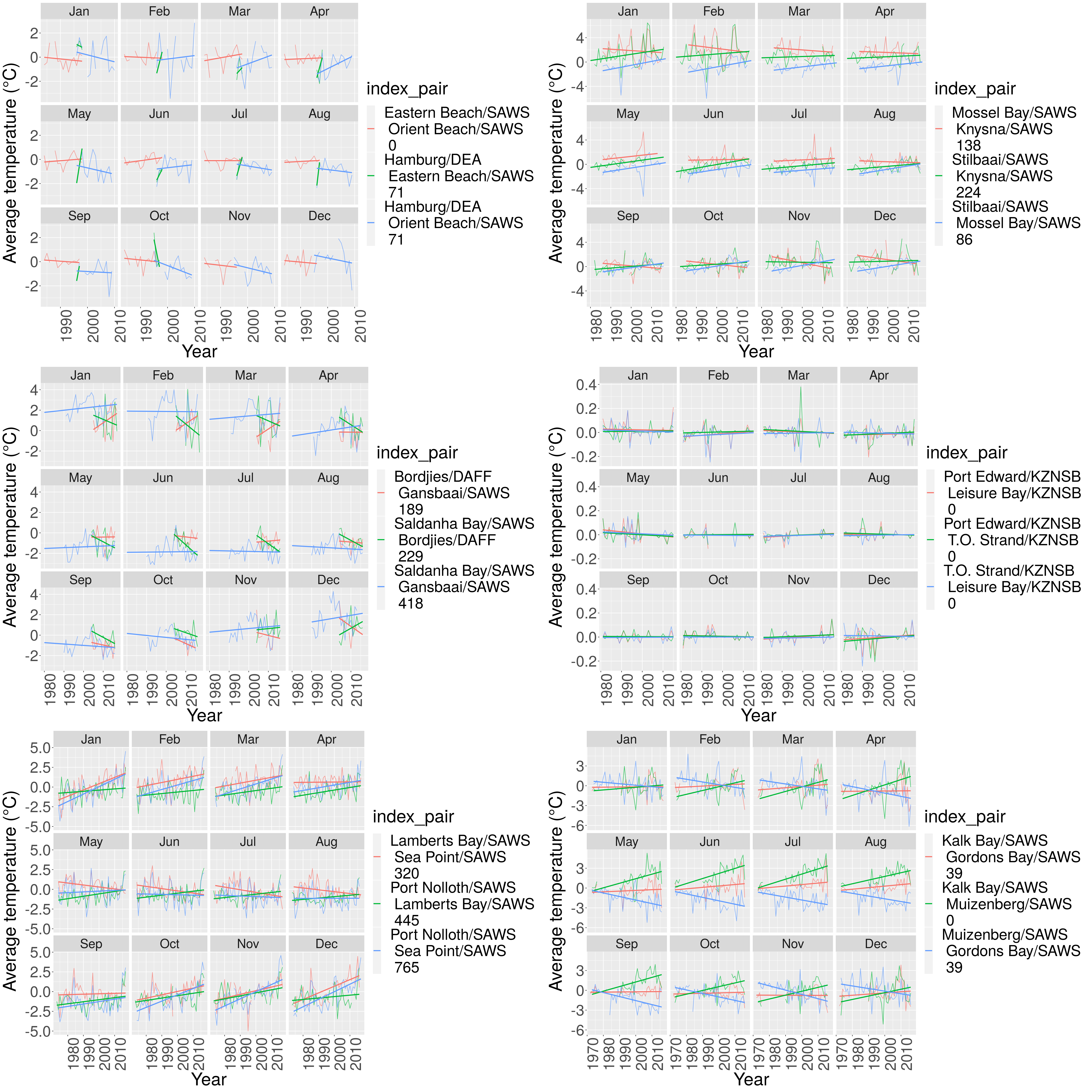
Figure 2: Line graphs representing the monthly average temperatures between two sites (° Celsius). Each graphic showing a different month overtime from 1990 to 2016. These site locations are coloured by the temperature statistic relative to the legends provided. The linear lines are the linear models in their respective colours
Monthly comparisons
On a monthly basis, differences of average temperatures between sites within cluster 1 (Cape Agulhas, Gansbaai, Mosterts Hoek, and Ystervarkpunt) varied on an apparent seasonal basis. During the summer months we saw that there were large differences in average temperatures between Gansbaai and the remaining three sites, and between Mosterts hoek and Cape Aghulus. Towards the end of summer and autumn months, in addition to the continuing trends observed between Gansbaai and the remaining sites, we then also saw differences in average temperatures between Cape Agulhas and Mosterts Hoek, and Ystervarkpunt respectively. During winter we see very little differences in average temperatures between all four sites, and this remained relatively stable over the time period. During spring months there were differences between average temperatures of Cape Agulhas and Gansbaai which continues into summer.
Converse to the first cluster, in the cluster containing Kalk Bay, Gordons Bay, Muizenberg and Hermanus, the largest differences in average temperatures were observed during autumn and winter months. In this cluster we saw large differences in average temperatures between Muizenberg and the remaining sites, with the differences increasing annually throughout 1972 and 2016 during winter. Similarly, differences of average temperatures also increased between Kalk Bay and Muizenberg during these same months. In the summer and spring months we saw relatively little differences in average temperatures between sites, with minimal differences in the rates of these changes over the 44 year time period. These rates increased during spring.
In the cluster comprised of Bordjies, Lamberts Bay, Betty’s Bay,and Port Nolloth, we found large differences in average temperatures between sites at selected months between 2000 and 2016. During summer months, differences in average temperature between Lamberts Bay and the remaining sites increased throughout the 16 year time period. There were large increases in differences of average temperature between Port Nolloth and Bettys Bay throughout spring months. For the remaining sites, differences in average temperatures were relatively low throughout each month for the same time period.
In the fourth cluster, which was comprised of Antsey’s Beach, Glenmore, Port Edward, and Richards Bay, we found small changes in the differences of average temperatures between sites on a monthly basis between 1980 and 2016. Here, the biggest differences in temperatures were observed towards the end of spring and during summer months where we found large differences in average temperatures occurring between Port Edward and the remaining three sites. Some differences were also seen during the autumn months but temperatures were relatively stable throughout the remaining seasons across these four sites.
Amieroh Abrahams
Scientist with a passion for data, statistics; the ocean and the oceangraphic processes associated with it.